# Initialize Otter
import otter
grader = otter.Notebook("lab05.ipynb")
Lab 5 – Visualization
Data 6, Fall 2025
So far, we have discussed methods to interpret the data, but what if we want to present our data in a visual format? In this lab, you’ll learn several important table methods for producing data visualizations. Visualizations are some of the most powerful tools in data science; they’re helpful for showing data to people who don’t necessarily have a background in data science, and allow data scientists like yourselves to help others understand the data in a more intuitive way.
We’ve talked about the scatter and plot methods, which allow us to visualize two numerical variables at once. We’ve also talked about the barh method, which allows us to display numerical values for categorical variables. These methods can open up more patterns in the data we otherwise would not have noticed.
As data scientists, it is not only our job to be able to implement various visualization methods, but also to know when to use each method. As we build our toolkit of visualization techniques going forward, it’s important to understand the advantages and disadvantages of each visualization type.
# Run this cell to load all required Python libraries
import numpy as np
from datascience import *

%matplotlib inline
import matplotlib.pyplot as plt
plt.style.use("fivethirtyeight")

import warnings
warnings.simplefilter('ignore')salary dataset that we'll be using today, which includes information on jobholders and their salaries, came from Kaggle and was supposedly combined from multiple surveys, job postings, and other public sources. However, the Kaggle source does not provide any of the original sources that the data was taken from, so we have no idea how reliable or real this data is. It's okay to use data like this for the sake of practice, but when doing so, it is important to remember that the conclusions you can make become much less reliable and trustworthy. When looking to use data that can make an impact, be sure to thoroughly research where your data is coming from and how it was collected. Keep this fact in mind as you're going through the lab!"Years of Experience" variable to test our informal hypothesis that an individual's years of experience may be positively correlated with their salary. Let's start this exploration with scatter plots.salary_data.csv file. This data required a lot of cleaning and manipulating behind the scenes in order to produce the visualizations in the lab, so be sure to keep that in mind: a lot of the time, you'll need to put work into preparing your data for analysis and visualization! Since some of the methods are out-of-scope for this course, we've done the cleaning for you beforehand.salary = Table.read_table("salary_data.csv")
salary.show(5)Contextualizing the Data
As data scientists, it’s important to take a look at the data we’re working with to understand the information we have available to us. Take some time to look at our salary table and try to understand what information we have.
Question 1.1 (Discussion)
What information does our table tell us? Additionally, what does each record (i.e. row) represent? In other words, what is the unit of analysis of our dataset?
Type your answer here, replacing this text.
Question 1.2 (Discussion)
Are there any features (columns) of the data that may affect one another? What patterns can we learn from this data?
Type your answer here, replacing this text.
The scatter method
As we mentioned, visualizing two variables can show us patterns in the data. The scatter method allows us to see the relationship between two numerical variables in our data by producing a scatter plot. The first provided column name goes along the x-axis and the second goes along the y-axis.
Let’s take a look at the relationship between years of experience and salary using our salary table.
Producing Scatter Plots
Now, we can call scatter on the salary table. Run the following cell to do so.
salary.scatter("Years of Experience", "Salary")Just like that, you’ve produced your first scatter plot! It looks a little messy, however. Often, scatter plots can suffer from what’s known as overplotting: when many data points fall on top of each other, creating a blob of data. When this happens, it’s often difficult to see the individual data points.
To fix this, we can focus in on a smaller subset of the data. In this case, we’ll look at individuals who have a PhD education level.
# Create a smaller subset of data; only individuals with a PhD
scatter_phd = salary.where("Education Level", "PhD")
scatter_phd
Question 1.3
Using the scatter_phd table, produce a scatter plot that plots "Years of Experience" on the x-axis and "Salary" on the y-axis. Your code should be very similar to the previous scatter plot.
# Replace the ... with the necessary code to plot the scatter plot
...
That looks a little better! There is still a cluster of data points in the bottom left corner, but a relationship can be seen between the two variables.
"Years of Experience" feature is represented.Question 1.4 (Discussion)
What relationship between years of experience and salary (for PhD holders specifically, in this case) does the above scatter plot reveal? Discuss with someone around you and check in with your GSI once you’ve agreed on an answer.
Type your answer here, replacing this text.
Optional argument: group
The scatter method also allows you to specify a group for each data point using the group keyword argument.
Say we wanted to investigate the relationship between an individual’s years of experience and their salary with respect to their reported gender.
scatter_phd.scatter("Years of Experience", "Salary", group = "Gender")By utilizing the group argument, we see our scatter plot stratified into the different categories our data has for gender. This gives us a better insight into the trends of the relationship between years of experience and salary for each gender, rather than simply looking at all gender categories together.
Question 1.5 (Discussion)
Are there any patterns you can notice from the scatter plot? Gender biases, when one gender is given preferential treatment (promotions, higher salaries, less work, etc.) over another or when there is a prejudice against one gender, can be prevalent within the workplace. Does this scatter plot show any gender biases? What might this look like in a real-world setting?
Type your answer here, replacing this text.
Scatter plots are useful when visualizing two numerical variables together. If you want to plot two numerical variables but one variable corresponds to time, we can use a line plot to visualize this instead.
[Tutorial] The .group Method
Before we learn how to create line plots, it’ll be useful to learn about the .group method. The .group method lets us group rows in a table by the values of one column. It then aggregates those rows into a single row per unique value. If you group a table by one column with no extra arguments, the resulting table displays two columns: the unique columns in the specific column, and the counts of each value.
salary.group('Education Level')You can also give .group an optional second argument: an aggregation function (i.e., that takes in an array and outputs a value, like np.mean or np.max). This argument will call that function on each column in the group, if possible.
salary.group('Education Level', np.mean)Notice that np.mean cannot be computed on strings, so there is nothing in the "Education Level mean" and "Job Title mean" columns.
The plot method
Similar to scatter, we give plot the names of two numerical columns and it creates a line plot for us. If we want to draw multiple line plots on the same set of axes, we give it a table with multiple numerical columns, and tell it which one contains the values for the x-axis.
The plot method allows us to see how non-time variables change over time. Let’s use plot to look at the age patterns over the course of years of experience. First, we will look at a single line plot using plot:
# Just run this cell
experience_age = salary.group("Years of Experience", np.mean).drop("Gender mean", "Job Title mean", "Education Level mean", "Salary mean")
experience_age
Question 2.1
Using the experience_age table and the plot method, produce a line plot that plots the average age over years of experience.
Hint: You’ll want to plot the years of experience on the x-axis and average age on the y-axis.
# Replace the ... with the necessary code to plot the line plot
...
Identifying Temporal Patterns
Line plots are incredibly effective tools for identifying temporal patterns (i.e. changes over time). Let’s utilize our newfound knowledge of the plot method to uncover underlying temporal patterns within each education level as they get more years of experience. Run the following cell to create tables for each education level and the average salary for each additional year of experience. The subsequent cells will create their respective plots. Analyze the graphs and answer the question that follows.
# Create tables for each education level
hs_salary_avg = salary.where("Education Level", "High School").group("Years of Experience", np.mean).drop("Gender mean", "Job Title mean", "Education Level mean", "Age mean")
bachelor_salary_avg = salary.where("Education Level", "Bachelor's Degree").group("Years of Experience", np.mean).drop("Gender mean", "Job Title mean", "Education Level mean", "Age mean")
master_salary_avg = salary.where("Education Level", "Master's Degree").group("Years of Experience", np.mean).drop("Gender mean", "Job Title mean", "Education Level mean", "Age mean")
phd_salary_avg = salary.where("Education Level", "PhD").group("Years of Experience", np.mean).drop("Gender mean", "Job Title mean", "Education Level mean", "Age mean")
# Run this cell to produce a line plot for the high school education salary average
hs_salary_avg.plot("Years of Experience", "Salary mean")
print("High School Degree Salary Mean")# Run this cell to produce a line plot for the bachelor's degree salary average
bachelor_salary_avg.plot("Years of Experience", "Salary mean")
print("Bachelor's Degree Salary Mean")# Run this cell to produce a line plot for the master's degree salary average
master_salary_avg.plot("Years of Experience", "Salary mean")
print("Master's Degree Salary Mean")# Run this cell to produce a line plot for the PhD salary average
phd_salary_avg.plot("Years of Experience", "Salary mean")
print("PhD Salary Mean")Question 2.2 (Discussion)
What patterns do you notice when comparing these line plots? Do any of them stand out to you? Do the results you are seeing make sense with respect to your knowlege of education levels? Be sure to pay close attention to the scales of the axes for each plot!
Type your answer here, replacing this text.
Multiple Variables
If we want to visualize multiple variables on one plot, we can include them all in the table we call plot on.
experience_age_salary = salary.group("Years of Experience", np.mean).drop("Gender mean", "Education Level mean", "Job Title mean")
experience_age_salary
Since we are trying to compare "Salary mean" and "Age mean" and their units are different, we have to manipulate the data before plotting. To do this, let’s first divide the "Salary mean" column by 1000 to get a better sense of the relationship. The cell below does this data manipulation for you.
experience_age_salary = experience_age_salary.with_column('Salary mean', experience_age_salary.column('Salary mean') / 1000)
experience_age_salary
Question 2.3
Using the experience_age_salary table, write a line of code that produces the following plot:
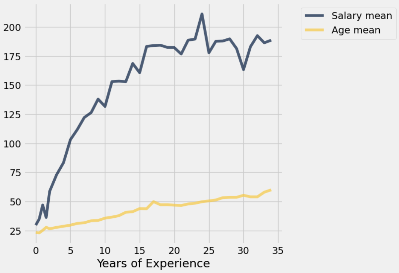
# Replace the ... with the necessary code to plot the line plot
...
print("Salary Mean and Age Mean vs. Years of Experience")As stated in the introduction, this dataset contains information on jobholders and their salaries, so we’ll be using it today to visualize some of the relationships between various characteristics of a jobholder and their salaries. For example, what sort of relationship might we see between an individual’s gender and their salary? Is there a correlation between an individual’s education level or years of experience and their salary? These are interesting starting questions to dive into exploration of the data, but remember what we said in the introduction: we aren’t sure of the reliability of this data, so if we wanted to make concrete conclusions, we would need to check our results against more reliable sources.
In this third part of the lab, we’ll be looking at some methods for visualizing one variable, whether it’s numeric or qualitative.
The barh method
The barh (horizontal bar chart) method is used to visualize categorical variable values. Categorical variables are non-numbers, like names and qualities (Color, Gender, Name etc.). As we saw in lecture, categorical variables come in 2 different types: ordinal and nominal. Refer to Chapter 5 of the course notes to see the difference between the two types.
The barh method takes in 1 mandatory argument, which is the name of the column you want on the left (vertical) axis of your barh plot. There are also optional arguments that have to do with plotting -- you’ll see examples of those in this lab and in the homework. The remaining optional arguments in the datascience documentation linked above can also be used, feel free to try out some of the others on your own!
Important note: To use the barh method properly, we first need to select the columns we want to see in the graph. We should not call barh directly on a large Table because without specifying a column, we get a bar graph for every single instance of every single variable, which you can imagine results in a lot of bar graphs. Therefore, in the cell below and throughout the lab we utilize more advanced table functions for aggregating the data to make visualization easier. Most of these functions are out of scope for this lab or this course. Just focus on the methods and functions for creating the visualizations throughout the lab!
# Just run this cell
gender = salary.group("Gender")
gender
Since the gender table only has two columns, we can plot it with barh. The plot below results in one bar for each gender category, corresponding to the number of rows in the table with that value.
gender.barh("Gender")Another column worth looking at is Education Level.
education = salary.group("Education Level")
education
Question 3.1
Following the example of the gender bar chart above, plot a horizontal bar chart that shows the counts of each category from the "Education Level" column.
Hint: Use the education table.
# Replace the ... with the necessary code to plot the bar chart
...
Based on the education table and the bar chart we created, it looks like Education Level is an ordinal categorical variable. However, our bar chart does not display the categories in order.
Question 3.2
Modify the education table to have the "Education Level" rows in the correct order.
education = ...Question 3.3
Recreate the bar chart you created in question 2.1 using the modified Education table, displaying the categories in the correct order.
...Multiple Columns
We can also use barh to see multiple statistics at once. Let’s use the barh method to see the average number of both age and years of experience for each eduction level. We’ll be using the following columns:
"Years of Experience": The average years of experience of the employees with that education level"Age": The average age of the employees with that education level
Run the following cell to load an aggregated version of the dataset that contains the average statistics for each education level.
education_averages = salary.group("Education Level", np.mean).drop("Gender mean", "Job Title mean")
education_averages
To look at only years of experience and age average for each education level, we need to select the "Education Level", "Years of Experience Average", and "Age Average" columns. We will discuss this method in the next lab, so don’t worry if it doesn’t make sense for now.
age_experience = education_averages.select("Education Level", "Years of Experience mean", "Age mean").take(make_array(1, 0, 2, 3))
age_experience
Run the following cell to show an example of how to create an overlaid bar chart with two statistics.
age_experience.barh("Education Level", overlay = True)If we want different visualizations for each variable, we can set the optional overlay argument to False. The default value of overlay is True, so if you don’t give it a value, you will get a plot with all the included variables at once.
age_experience.barh("Education Level", overlay = False)This way, we can choose if we want to create one plot with all our information or a new plot for each piece of information!
In this lab, we have covered some standard visualizations: line plots and scatter plots for two-dimensional numerical data, and bar charts for categorical data. We will discuss one more common visualization next time: the histogram. More soon!
Week 5 Survey
As a reminder, please fill out the Week 5 Survey, which is due today (Friday, September 26) at 5pm.
Done! 😇

Note: There is no autograder portion for Lab 05. As usual, please submit your zip file to the Gradescope portal for this lab, and your work will be manually graded.
Submission
Make sure you have run all cells in your notebook in order before running the cell below, so that all images/graphs appear in the output. The cell below will generate a zip file for you to submit. Please save before exporting!
# Save your notebook first, then run this cell to export your submission.
grader.export(pdf=True)