# Initialize Otter
import otter
grader = otter.Notebook("hw03.ipynb")
Homework 3 – Data Visualization
Data 6, Fall 2025
This homework is due on Thursday, October 9 at 8:00PM.
You must submit the assignment to Gradescope. See the syllabus for our homework late submission policy.
Reminder: This homework assignment contains hidden tests, which means that even if the test passed, it does not mean your answer is 100% correct. The autograder in the homework is intended as a sanity check.
While we encourage you to collaborate with your peers, directly copying solutions is not allowed. Please refer to our syllabus on Academic Honesty. If you find yourself stuck on a problem, we recommend that you make a post on Ed or attend office hours.
# Run this cell, don't change anything.
from ipywidgets import interactive
from datascience import *
import numpy as np
import matplotlib.pyplot as plt
%matplotlib inline
plt.style.use("ggplot")
import seaborn as sns

import warnings
warnings.filterwarnings('ignore')
The penguins Dataset
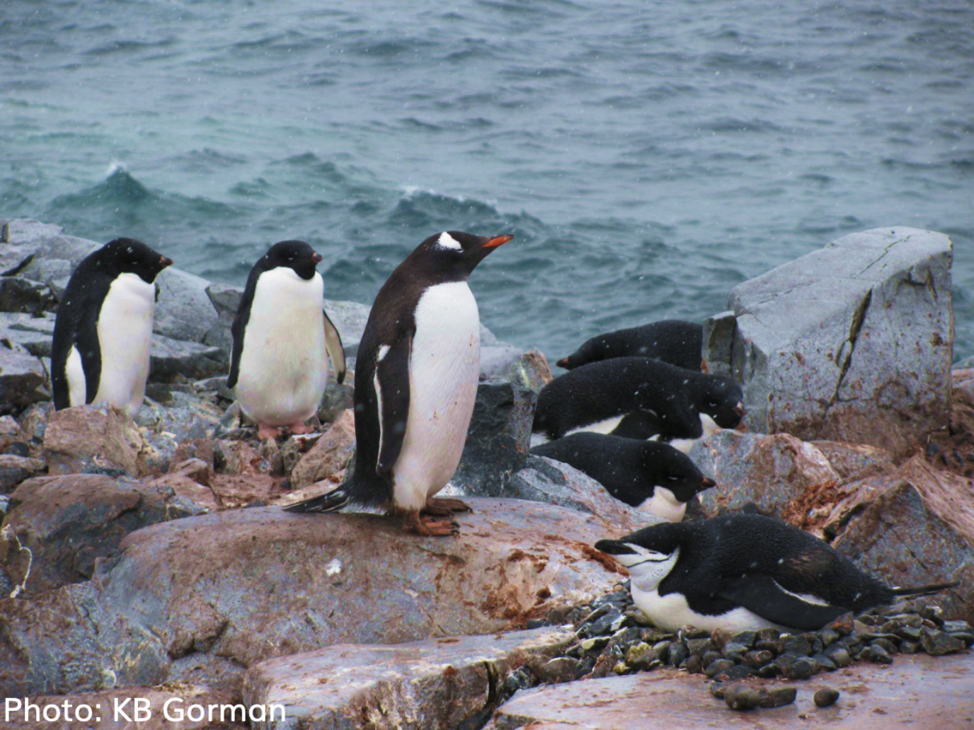
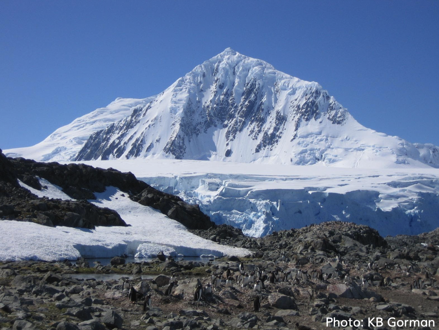
In this part of your assignment, we will explore a dataset containing size measurements for three penguin species observed on three islands in the Palmer Archipelago, Antarctica. The data was collected by Dr. Kristen Gorman, a marine biologist from 2007 to 2009.
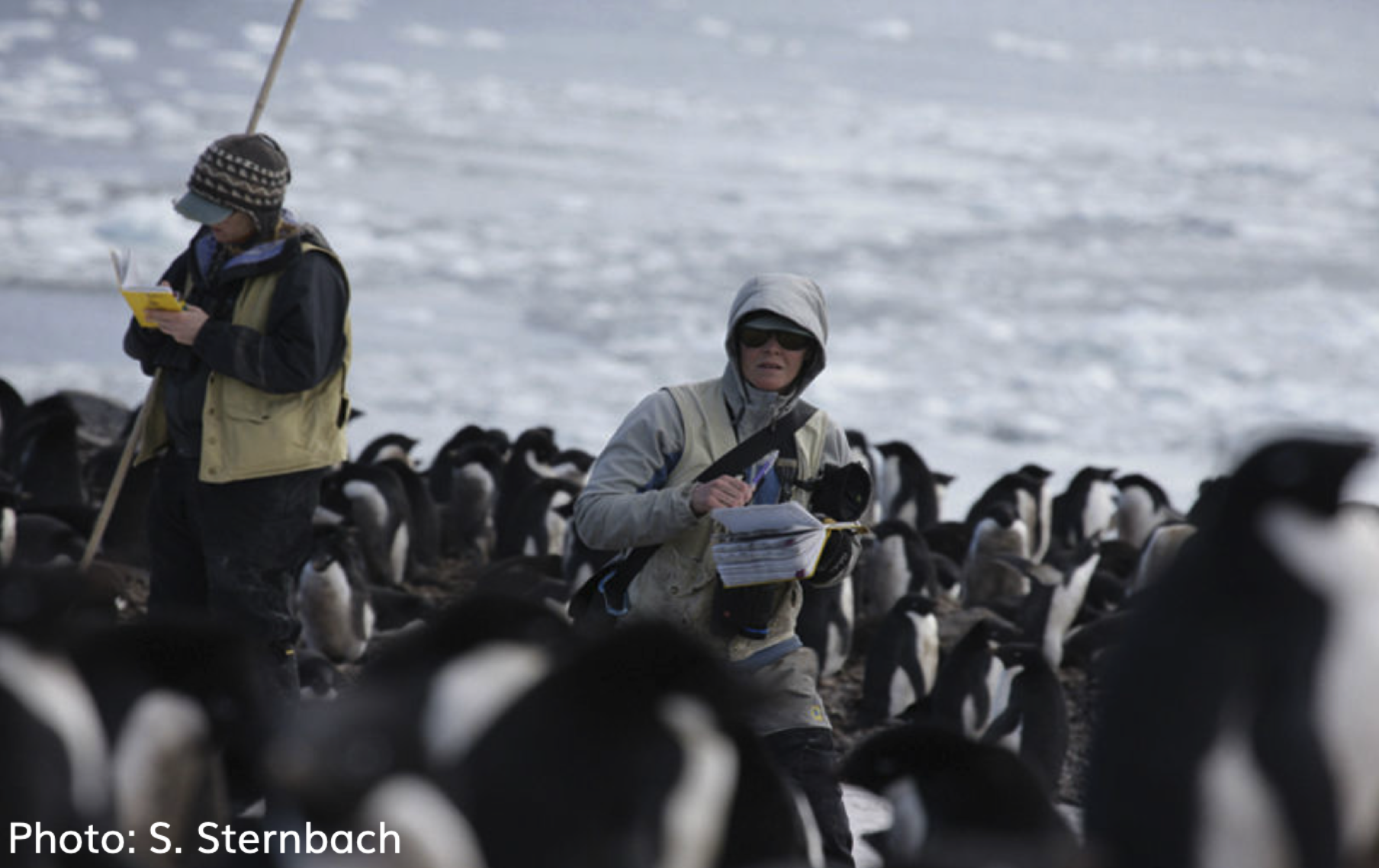
Here’s a photo of Dr. Gorman collecting the data in the wild:

Run the cell below to load in our data.
# Run this cell!
penguins = Table.read_table("penguins.csv")
penguins.show(5)
Variables
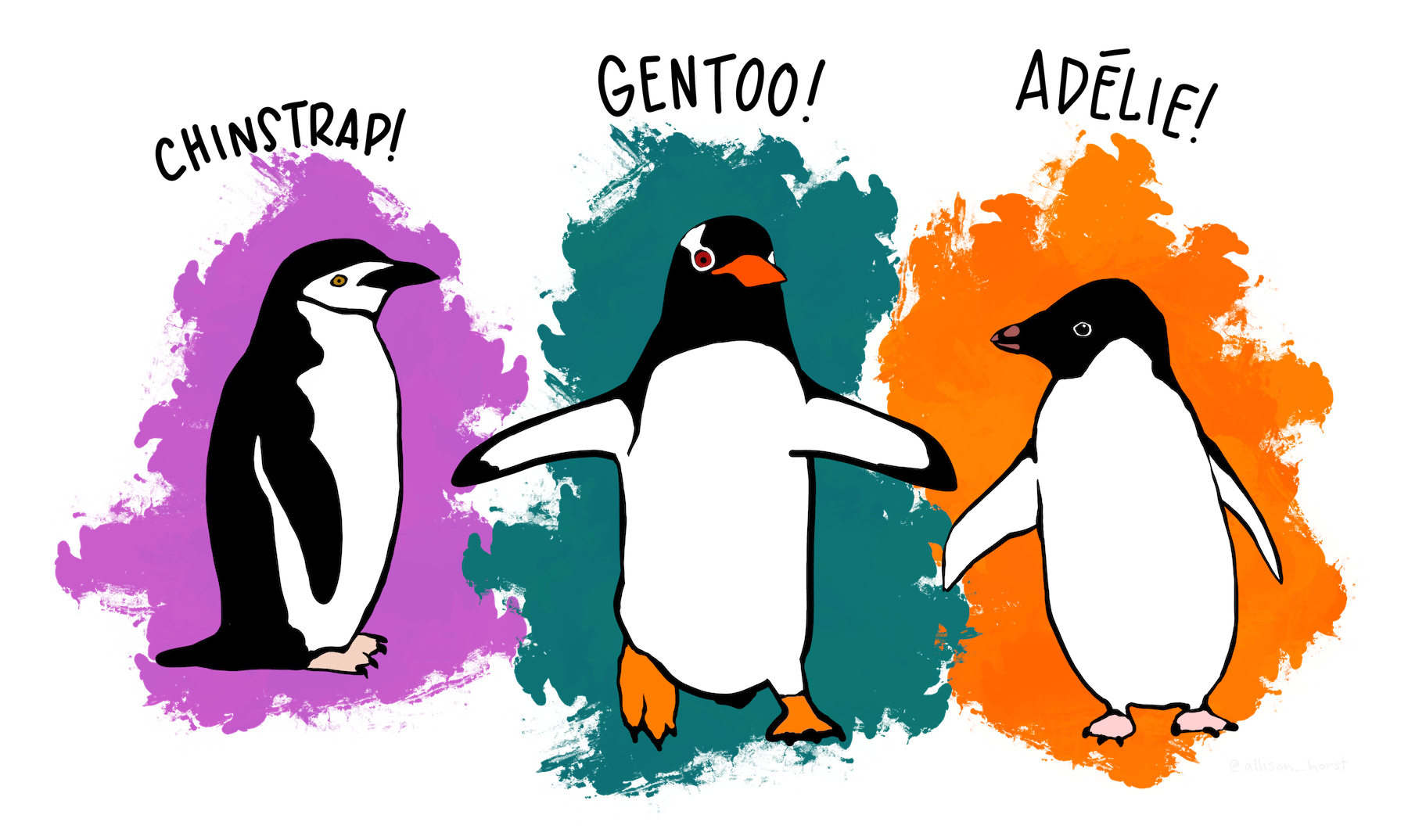
speciesThere are three species of penguin in our dataset: Adelie, Chinstrap, and Gentoo.
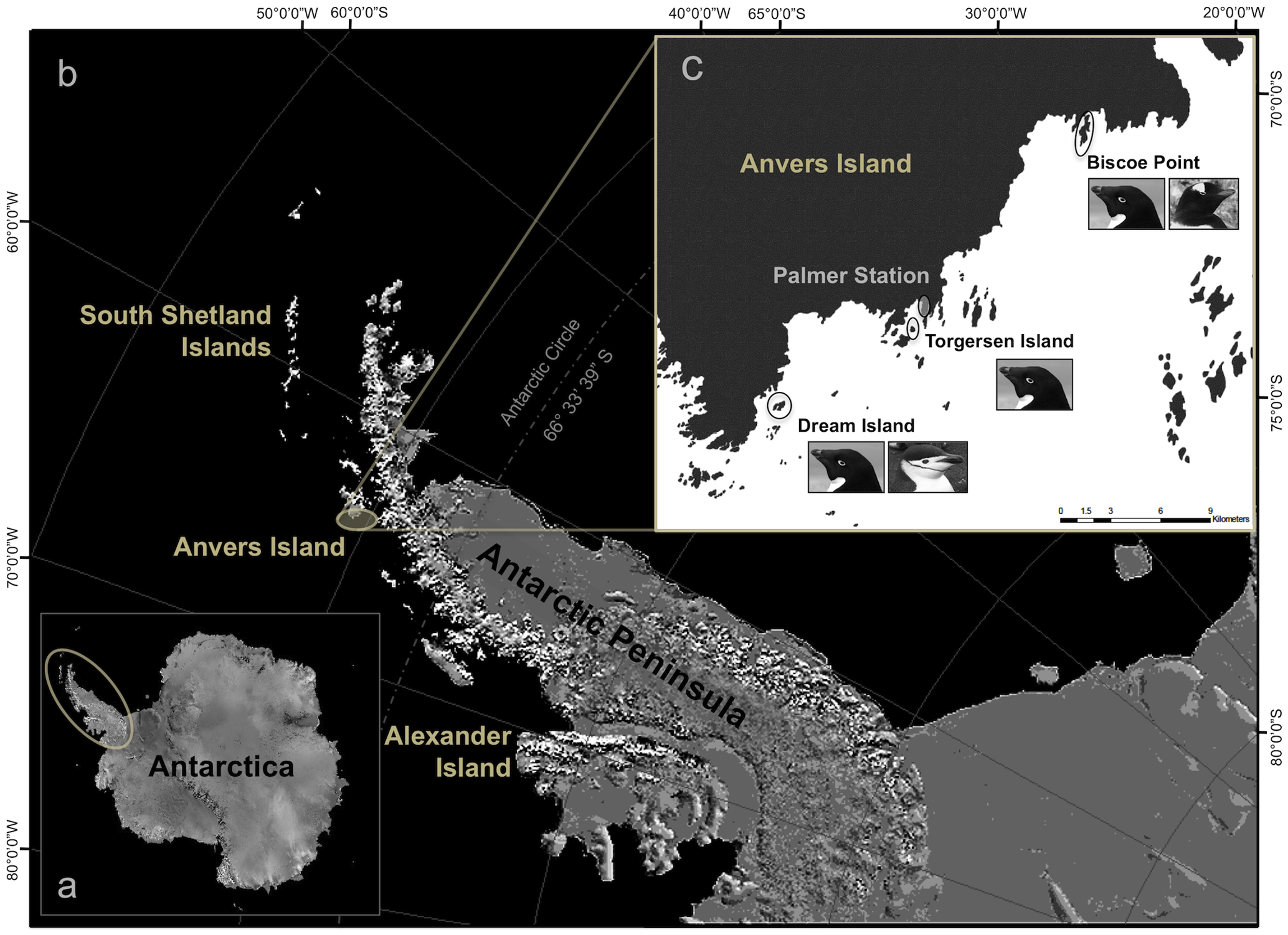
islandThe penguins in our dataset come from three islands: Biscoe, Dream, and Torgersen. (The smaller image of Anvers Island (image source may initially be confusing; the dark region is land and the light region is water.)
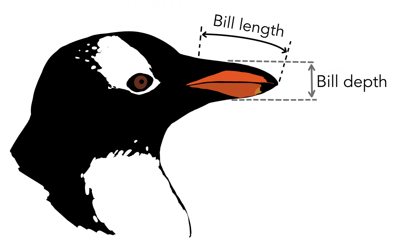
bill_length_mm,bill_depth_mm: See the illustration below.
flipper_length_mm: Flippers are the equivalent of wings on penguins.body_mass_gThe body mass of the penguin, in gramssex: The sex of the penguin
Question 1a
Let’s start by visualizing the distribution of the islands from which the penguins in our dataset come. Your friend Leanne says that using a histogram is the best way to do this. However, Sandra disagrees and says that using a bar chart is a better move. Who is right? Explain your answer.
Hint: What kind of variable is contained within the "island" column?
Type your answer here, replacing this text.
Based on your answer for the previous question, create an appropriate visualization to show the distribution of the islands from which the penguins come.
We’ve provided the islands table for you to use.
# just run this cell
islands = penguins.pivot("sex", "island")
islands = islands.with_column(
    "Total", islands.column("Female") + islands.column("Male"))
islands
Question 1b
In the code cell below, create a visualization with three bars, one for each island. The length of each bar should correspond to the total number of penguins from each island.
Hint: It may be helpful to create an intermediate table called island_total containing just the total penguins per island. How can you manipulate a certain table to help generate your chart? Check out the lecture notes and slides!
island_total = ...
...

# Do not change any code below this comment
print("Penguins per Island")
Question 1c
In the code cell below, create a visualization with six bars, displaying the count of Male and Female penguins per island.
Hints:
Like before, it may be helpful to create an intermediate table called
island_sexcontaining the male penguin and female penguin counts per island:island Female Male Biscoe 80 83 Dream 61 62 Torgersen 24 23 Check out Inferential Thinking Chapter 7.3 on how to create overlaid bar charts.
island_sex = ...
...

# Do not change any code below this comment
print("Male and Female Penguins per Island")
Question 2 - Histograms
Adelie, Chinstrap, and Gentoo penguins.
Great! Now that we’ve explored the distributions of some of the categorical variables in our dataset (species and island), it’s time to study the distributions of some of the numerical variables.
As a refresher, here’s the original penguins table.
penguins.show(5)penguins.num_rowsQuestion 2a
Produce a histogram that visualizes the distributions of body mass (in grams) of all penguins in penguins, using the given bins in equal_bins. Let the area of each bar be the percent of entries in each bin.
Hint: See the Python reference if you’re stuck on how to specify bins.
equal_bins = np.arange(2000, 7100, 500)

...
Question 2b
Let’s take a closer look at the y-axis label. Assign unit_meaning to an integer (1, 2, 3) that corresponds to the “unit” in “Percent per unit”.
gram
penguin
half-kilogram
unit_meaning = ...
unit_meaninggrader.check("q2b")Question 2c
Assign percent_under_3500 to the percentage of penguins that weigh less than 3500 grams. Use the height variables provided below in order to compute the percentages. Your solution should only use height variables, numbers, and mathematical operations. You should not access the penguin table in any way.
bin_height_under_3000 = 0.005
bin_height_3000_to_under_3500 = 0.036

percent_under_3500 = ...

percent_under_3500grader.check("q2c")Question 2d
Sandra takes a quick glance at the histogram you made earlier in this question and claims the following:
“I can tell you what percentage of penguins have body masses between 5000 and 5200 grams, only using the histogram above.”
Leanne disagrees with Sandra, stating:
“That’s not true. You’d need more than just the histogram above to know that information.”
Who is correct in this situation: Sandra or Leanne? Explain why the other person is incorrect, providing justifcation based on what you’ve learned about histograms.
Type your answer here, replacing this text.
Question 2e
This is a multi-part problem to practice your table transformation skills from the previous homework. Given a table of number of entries per bin, you will compute the heights of the histogram of percentages you graphed earlier in this question.
The bins_mass table displays the counts of penguins in each of the body mass bins.
# just run this cell
equal_bins = np.arange(2000, 7100, 500)
bins_mass = penguins.bin("body_mass_g", bins=equal_bins)
bins_mass
The above bins_mass table was computed using the bin method, analogous to the group method used in the case of categorical data. From Inferential Thinking,
Section 7.2.1, edited slightly for this context:
The
binmethod takes as its argument a column label or index, and an optional argument in which you can specify the bins that you want.The result is a two-column table that contains the number of rows in each bin. The first column lists the left endpoints of the bins (but see the note about the last bin, below).
... The last bin: Notice the bin value [6500] in the last row. That’s not the left endpoint of any bin. Instead, it’s the right endpoint of the last bin.
Question 2e(i)
In the code cell below, create a new table bins_mass_expanded that is bins_mass with a third column called body_mass_g percent with the percentage of entries in each bin. Again, the last row is the right endpoint of the last bin, so the corresponding entry in this new column should be 0.
After running the below cell, your new table bins_mass_expanded should have the form:
| bin | body_mass_g count | body_mass_g percent |
|---|---|---|
| 2000 | ... | ... |
| ... | ... | ... |
| 6000 | ... | ... |
| 6500 | 0 | 0 |
Hints:
It may be helpful to first create an intermediate array called
percentwith the values of the new third column. Then, add the column tobins_mass. We’ve done this in two lines, but depending on your solution you may need more.How many total penguins are there?
percent = ...
bins_mass_expanded = ...grader.check("q2e_i")Question 2e(ii)
Next, create a new table bins_mass_ppu that is bins_mass_expanded with a fourth column called percent per unit with the heights of the histogram that you plotted earlier. Recall that each bar’s height is the percentage of entries in the bin divided by the bin width. Again, the last row is the right endpoint of the last bin, so the correpsonding entry in this new column should be 0.
After running the below cell, your new table bins_mass_percent_per_unit should have the form:
| bin | body_mass_g count | body_mass_g percent | percent per unit |
|---|---|---|---|
| 2000 | ... | ... | ... |
| ... | ... | ... | ... |
| 6000 | ... | ... | ... |
| 6500 | 0 | 0 | 0 |
Hints:
It may be helpful to first create an intermediate array called
ppuwith the values of the new column before addingppuas a column tobins_mass_expandedWe’ve done this in two lines, but depending on your solution you may need more.In our binned example, every bin has the same width: 500 grams.
ppu = ...
bins_mass_ppu = bins_mass_expanded.with_columns("percent per unit", ppu)
bins_mass_ppugrader.check("q2e_ii")Question 2f
When creating histograms, it’s important to try several different bin sizes in order to make sure that we’re satisfied with the level of detail (or lack thereof) in our histogram.
Run the code cell below. It will present you with a histogram of the distribution of our penguins’ body masses, along with a slider for bin widths. Use the slider to try several different bin widths and look at the resulting histograms.
from ipywidgets import interactive

# Don't worry about the code, just play with the slider that appears after running.
def draw_mass_histogram(bin_width):
    plt.figure(2)
    sns.histplot(data=penguins, x="body_mass_g", bins = np.arange(2700, 6300+2*bin_width, bin_width))
    plt.title(f"Body mass (g) with bin width {bin_width}")
    plt.show()

interactive(draw_mass_histogram, bin_width=(25, 2000, 25))Task: In the cell below, compare the two histograms that result from setting the bin width to 100 and 750. What are the pros and cons of each size? (Remember that these histograms are displaying the same data, just with different bin sizes.)
Type your answer here, replacing this text.
Let us now use box plots to examine and compare flipper lengths. In Data 6, you should be able to sketch and interpret box plots, but you will not need to know how to write the associated plotting code.
Here is the penguins table again, for your convenience:
# just run this cell
penguins.show(5)
Question 3a
Consider the distributions of flipper lengths, in millimeters. In the cell below, assign flipper_q1, flipper_q3, and flipper_iqr to the first quartile, the third quartile, and the interquartile range (IQR), respectively.
Hint: Use percentile. See the Data 6 Python Reference.
flipper_q1 = ...
flipper_q3 = ...
flipper_iqr = ...

# do not edit below this line
print(" Q1:", flipper_q1)
print(" Q3:", flipper_q3)
print("IQR:", flipper_iqr)grader.check("q3a")This box plot summarizes flipper lengths (in millimeters) of all penguins in penguins:
# just run this cell
plt.figure(figsize=(5, 1))
sns.boxplot(data=penguins, x="flipper_length_mm", whis=(0, 100))
plt.xlim((170, 235))

print("Penguin flipper lengths")
Question 3b
Assign percent_above_q1 to an integer (1, 2, 3, 4, 5) that corresponds to the percentage of penguins with flippers at least as large the first quartile.
20%
25%
50%
75%
100%
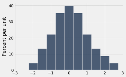
percent_above_q1 = ...grader.check("q3b")Next, consider the below histogram that visualizes the distributions of flipper lengths (in millimeters) of all penguins in penguins.
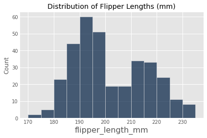
Question 3c
Using the box plot and the histogram above, assign flipper_median_bin to an integer (1, 2, 3, or 4) that corresponds to the bin that contains the median millimeters (mm). Note that the upper bound of these bins is excluded from the bin and denoted by the parenthesis; the lower bound is included in the bin and denoted by the square bracket.
mm
mm
mm
mm
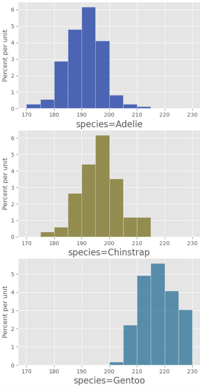
flipper_median_bin = ...grader.check("q3c")Consider the following boxplots, which summarize flipper lengths (in millimeters) of penguins disaggregated by species:
# just run this cell
plt.figure(figsize=(7, 3))
sns.boxplot(data=penguins, x="flipper_length_mm", hue="species", whis=(0, 100))
plt.xticks(np.arange(170, 235, 5))
print("Boxplot of flipper lengths (mm) by species")
Question 3d
Use only the boxplots above to assign array_answers to an integer array that corresponds to the true statement below. Your array should have at most four integers, and values should not repeat.
50% of Chinstrap penguins have longer flipper lengths than 50% of Adelie penguins.
Gentoo penguins have the widest range of flipper lengths.
The Gentoo penguin with the smallest flipper lengths still has longer flippers than most Adelie and Chinstrap penguins.
On average, there were more Gentoo penguins surveyed than Adelie or Chinstrap penguins.
array_answer = ...grader.check("q3d")Question 3e
Using the penguins table and the hist table method and its various optional arguments, re-create the following set of histograms:
Note: Use the my_bins variable we’ve defined as the optional bins arugment of the hist method. See the Data 6 Python Reference.
my_bins = np.arange(170, 235, 5)
plt.figure(figsize=(47,2))
...
Question 4a
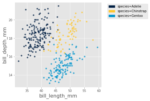
Use the following cell to produce a scatter plot that plots "bill_length_mm" on the x-axis and "bill_depth_mm" on the y-axis. Additionally, the scatter plot should plot each penguin species as its own, unique color. Your plot should look like this (perhaps with some color variation):
Hint: You may find the optional arguments of the scatter method helpful. See the Data 6 Python Reference for more details.
...Question 4b
Here’s a breakdown of the visualization above:
Position on the x-axis represents bill length.
Position on the y-axis represents bill depth.
Color represents species, as per the legend on the right.
You’ll note that there are three general “clusters” or “groups” of points, corresponding to the three penguin species. Use the scatter plot to fill in the blanks below. Both blanks should be a species of penguin.
"It appears that the distribution of bill lengths of Chinstrap penguins is very similar to the distribution of bill lengths of [Answer for Question 4bi] penguins, while the distribution of bill depths of Chinstrap penguins is very similar to the distribution of bill depths of [Answer for Question 4bii] penguins."
Question 4bi
q4bi_answer = ...
q4bi_answergrader.check("q4bi")Question 4bii
q4bii_answer = ...
q4bii_answergrader.check("q4bii")Question 4c
While the visualization above is helpful in distinguishing between species, we lose important information -- one such feature we lose is the sex of the penguin. To visually compare the male and female penguins, we must do some additional digging.
Task: In the cell below, plot a scatter plot for only the Gentoo penguins with "bill_length_mm" on the x-axis and "bill_depth_mm" on the y-axis, color coded by the value in the "sex" column.
Hint: You may want to create a new table which only includes rows from the penguins table that correspond to Gentoo penguins.
gentoo = ...
...
If you’ve created the plot above correctly, you’ll notice that male Gentoo penguins tend to have both longer and deeper bills.
[for fun] The Power of Visualizations
Look back to the scatter plot you created in the first part of this question. We used the "bill_length_mm" and "bill_depth_mm" to produce a visualization that allows us to group the different penguin species together. This is a basic form of clustering, an extremely powerful tool in data science. We won’t get into clustering in this class (or even Data 8), but you may come across it in upper division classes.
Just for fun, run the following cell to produce a three dimensional scatter plot using the "bill_length_mm", "bill_depth_mm", and "flipper_length_mm" columns.
# Just run this cell and play around with the visualization! You can zoom in and out, toggle on/off certain
# species, and move the plot around
Table.interactive_plots()
penguins.scatter3d("bill_length_mm", "bill_depth_mm", "flipper_length_mm", group="species")
Table.static_plots()
Question 5: 2-D to 1-D
Consider the following scatter plot:
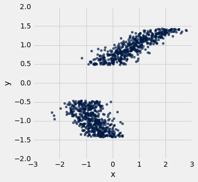
The axes of the plot represent values of two variables: and .
Suppose we have a table called t that has two columns in it:
x: a column containing the x-values of the points in the scatter ploty: a column containing the y-values of the points in the scatter plot
Below, you are given three histograms—one corresponds to column x, one corresponds to column y, and one does not correspond to either column.
Histogram 1:
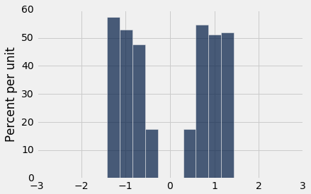
Histogram 2:
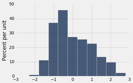
Histogram 3:
Question 5a(i)
Suppose we run t.hist('x'). Which histogram does this code produce? Assign histogram_column_x to either 1, 2, or 3.
Histogram 1
Histogram 2
Histogram 3
histogram_column_x = 3grader.check("q5a_i")Question 5a(ii)
State at least one reason why you chose the histogram from the previous part. Make sure to clearly indicate which histogram you selected (ex: “I chose Histogram 1 because ...”).
Type your answer here, replacing this text.
Question 5b(i)
Suppose we run t.hist('y'). Which histogram does this code produce? Assign histogram_column_y to either 1, 2, or 3.
Histogram 1
Histogram 2
Histogram 3
histogram_column_y = 2grader.check("q5b_i")Question 5b(ii)
State at least one reason why you chose the histogram from the previous part. Make sure to clearly indicate which histogram you selected (ex: “I chose Histogram 1 because ...”).
Type your answer here, replacing this text.
Done!
Congrats! You’ve finished your Data 6 homework assignment!
To submit your work, follow the steps outlined on Ed. Remember that for this homework in particular, many problems will be graded manually, rather than by the autograder.
The point breakdown for this assignment is given in the table below:
| Category | Points |
|---|---|
| Autograder | 14 |
| Written (Including Visualizations) | 17 |
| Total | 31 |
Pets of Data 6
Sunkist needs some head scratching before going to sleep. Can you help after submitting to Gradescope
Submission
Below, you will see two cells. Running the first cell will automatically generate a PDF of all questions that need to be manually graded, and running the second cell will automatically generate a zip with your autograded answers. You are responsible for submitting both the coding portion (the zip) and the written portion (the PDF) to their respective Gradescope portals. Please save before exporting!
Important: You must correctly assign the pages of your PDF after you submit to the correct gradescope assignment. If your pages are not correctly assigned and/or not in the correct PDF format by the deadline, we reserve the right to award no points for your written work.
If there are issues with automatically generating the PDF in the first cell, you can try downloading the notebook as a PDF by clicking on File -> Save and Export Notebook As... -> PDF. If that doesn’t work either, you can manually take screenshots of your answers to the manually graded questions and submit those. Either way, you are responsible for ensuring your submission follows our requirements, we will NOT be granting regrade requests for submissions that don’t follow instructions.
from otter.export import export_notebook
from os import path
from IPython.display import display, HTML
name = 'hw03'
export_notebook(f"{name}.ipynb", filtering=True, pagebreaks=True)
if(path.exists(f'{name}.pdf')):
    display(HTML(f"Download your PDF <a href='{name}.pdf' download>here</a>."))
else:
    print("\n Pdf generation failed, please try the other methods described above")
To double-check your work, the cell below will rerun all of the autograder tests.
grader.check_all()Submission
Make sure you have run all cells in your notebook in order before running the cell below, so that all images/graphs appear in the output. The cell below will generate a zip file for you to submit. Please save before exporting!
# Save your notebook first, then run this cell to export your submission.
grader.export(pdf=False)
Acknowledgments
Many of the pictures and descriptions in this homework assignment are from Dr. Allison Horst and Dr. Kristen Gorman. The data was collected as a part of the Long Term Ecological Research Network. If you’re curious about the origins of the data, see here for more details.
- (N.d.). Public Library of Science (PLoS). 10.1371/journal.pone.0090081.g001